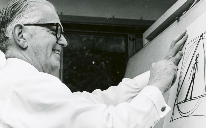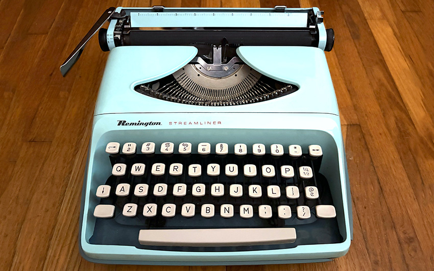
The Streamliner sits at the bottom of a family tree that starts somewhere better. In 1959, Sperry Rand’s Remington division put Carl Sundberg‘s design on the market as the Monarch, styled by Sundberg and his partner Montgomery Ferar, the industrial design firm behind the casing on the IBM Executive four years earlier, in 1955.
Sundberg’s fingerprints are all over mid-century office design. Collectors can trace a line from his work to designers like Ettore Sottsass, who created the Olivetti Valentine.
That Monarch shell got reused and cheapened across a run of names through the 1960s: Starfire, Streamliner, Riviera, and Capri, the last one sold through Sears under the Tower badge. Same body, different names, aimed at different shelves. Production had moved to Holland by then, after Remington pulled its manufacturing out of Glasgow over a labor dispute. The plastic shell is ABS, likely a Borg-Warner compound called Cycolac.
It’s a no-frills machine by design.
Machine Record
I broke my own rules, laid out in the Buyer’s Guide on this one. I said I would do it again, and I did.
I bought it because my collection doesn’t have a lot of sparkle power. Every machine is so serious: shades of black, grey or tan. This one is minty fresh. Next to everything else I currently own, it really stands out.
The guide also says a typewriter that can’t type is just a paperweight. Another rule I broke. This one isn’t coming off the shelf to write anything, and I’m not pretending otherwise. I doubt I’ll even bother to put a new ribbon in it.
Aesthetics

The color is the whole reason I purchased this machine. It’s got me wondering if car collectors do the same thing: does the guy with a warehouse full of restored classics ever buy a 1970s Ford Pinto for no reason beyond the color?
7/10 clacks.
Typing Feel

It feels cheap. I never got around to rating the typing feel on my Olivetti Valentine before I sold it, but this one lands in the same neighborhood, only worse. This is the second plastic-bodied machine I’ve owned, and it’s reaffirmed that I don’t care for how they type.
3/10 clacks.
Features

The Streamliner is bare bones. Sperry Rand built this line to be budget-friendly, not capable. Carriage shift instead of basket shift, no tab, no dedicated [1/!] key. It was built to be inexpensive, portable, and colorful.
4/10 clacks.
Portability

This is the bright spot. The typewriter is built into the bottom half of its case, so you never lift the machine free of its shell to use it. You type with the case still half-attached, base and all, no separate carrying step to think about. Small, plastic, and already wearing its own case: this is about as portable as a manual typewriter’s design gets.
8/10 clacks.
Historical Significance
Low, to put it plainly. This is a rebadge of a rebadge, not a machine with a claim to significance on its own. What it’s got instead is a design pedigree worth naming: the same lineage as a Carl Sundberg design, built during a wave of colorful ABS-shelled portables that Sperry Rand pushed out of its Dutch plant through the late 1960s.
3/10 clacks.
Overall

Bought against my own advice, for reasons my buying guide would flag as a hard pass. It isn’t a collectible in any real sense, and there’s nothing I’d brag about to another typewriter enthusiast. I struggled to even fill out this post.
And that’s the point.
I’m not curating to impresses other collectors. This is a hobby, and part of it is just supposed to be fun. I love the color. That’s the entire case for owning this typewriter, and it was enough.
5/10 clacks.