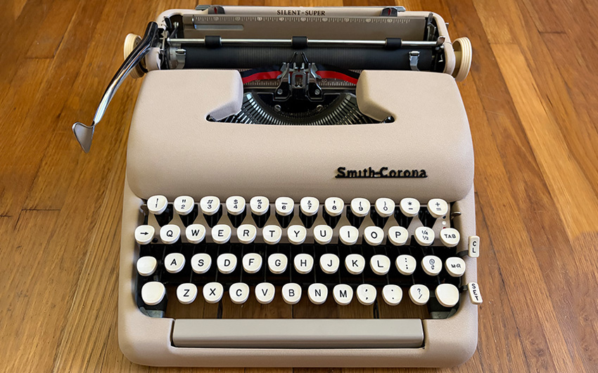
By 1956, Smith-Corona was building machines that felt serious and stylish at once, and the Silent Super still turns up in more collections than almost anything else from that decade.
Silent
True to its name, it was built for quiet: a softer platen compound to dampen the clack, felt glued inside the metal covers to swallow the rest. Whether it worked is a separate question. Most surviving Silent Supers sound like any other well-tuned portable now. The felt has compacted over eighty-some years. The platen compound has hardened right along with it. Whatever hush this machine had when it left the factory is mostly gone.
Super
This was the flagship of Smith-Corona’s 5T portable line, sitting above the Standard and the Sterling. Eighty-eight keys instead of eighty-four, including a dedicated [1/!] and [+/=], keys most typewriters from this era skipped. Cheaper machines still had you typing a lowercase L for the number one.
It also came with keyboard-set tabs, so a typist could set and clear a stop from the keys instead of reaching for the back of the machine, plus a touch control dial to adjust the keystroke resistance. The paper support “rabbit ears” sticking up off the back give it a silhouette collectors spot from across a room.
A Color Explosion
The Royal Quiet DeLuxe stayed in industrial gray. Smith-Corona didn’t. Beyond the standard Sapphire Grey, the Silent Super came in Alpine Blue, Coral Pink, Seafoam Green, and Desert Sand, a pastel typewriter built for the mid-century modern era. That range of color is most of why these machines still get chased today. A well-preserved pink or blue one, original paint intact, is a real find.
Machine Record
The QDL had left me a little deflated, so I went looking for something easier to like. Found this one on Marketplace, asking $200. Talked the seller down to $125, which was still more than I wanted to pay.
The case was junk. The machine underneath it wasn’t: a little Simple Green, a new ribbon, and it was ready to go.
Aesthetics

One of the best-looking machines of the whole era, Kodachrome colors that belong on a 1950s kitchen appliance more than a piece of office equipment. Mine is Desert Sand, probably the plainest color they made. I still want a Coral Pink one.
7/10 clacks.
Typing Feel

This machine is comfortable rather than fast, smooth rather than snappy. Squishy, the way a broken-in chair is squishy. The carriage return barely asks for effort. I could type on it all day with no complaints, though I’d trade some of that softness for more precision.
6/10 clacks.
Features

This was the loaded model in its day, and it still reads that way. The rabbit ears are my favorite detail. The platen comes out for cleaning, which makes servicing it simple.
8/10 clacks.
Portability
They’re called portables because the desktop machines they sat beside weighed thirty pounds or more. Portable is relative. This one splits the difference: light enough to carry, heavy enough that it doesn’t shift under your hands while you’re using it.
7/10 clacks.
Historical Significance
The clearest connection here is Arthur Miller, who married Marilyn Monroe in 1956. Whether she ever sat down at this particular model, I don’t know. No one wrote that detail down at the time. What’s certain is that this machine has been a daily driver for collectors and working writers for decades.
6/10 clacks.
Overall
Better than the QDL for me, by a wide margin. Solid, reliable, worth the price. These machines are common enough and cheap enough, as vintage typewriters go, that parts shouldn’t be hard to find for another hundred years.
7/10 clacks.