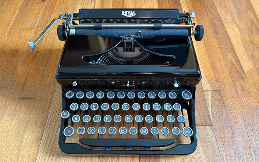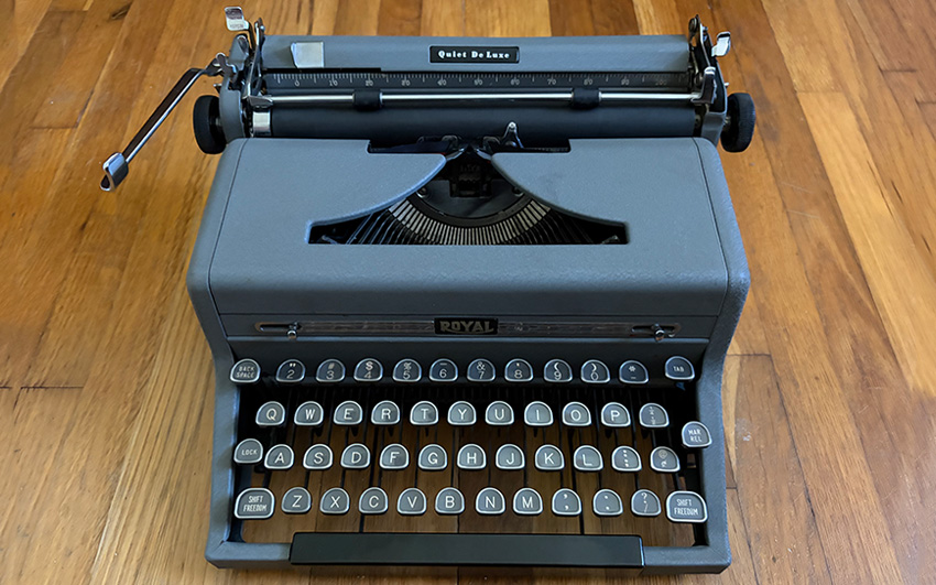
Every writer’s biopic seems to reach for the same machine eventually, cast wide behind a typing hand. That’s the Royal Quiet DeLuxe, often called the QDL. By 1949 it had been in production a full decade, minus the years Royal spent building for the war instead of for writers, and this particular year sits right before the last real change to its shape.
A Decade in the Making
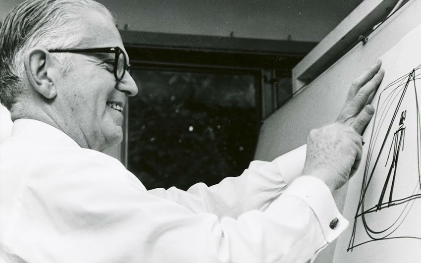
Royal introduced the Quiet DeLuxe line in 1939. Production stopped for the war and started again once it ended. By the late 1940s, industrial designer Henry Dreyfuss, the same man behind the Bell telephone most people picked up without a thought and the New York Central’s locomotives, had reworked the machine’s corners into the low-slung, rounded shape collectors now recognize on sight. Royal softened those corners again in 1950. That makes 1949 the last year of this particular silhouette before it changed again.
Signature Features
The Quiet DeLuxe has Royal’s Magic Margin: hold the lever, slide the carriage, margin set. No stops to find by feel. The finish is a textured “crinkle,” chrome trim laid over it. Most left the factory in a two-tone gray Royal called Gray Magic, typically pica, ten characters to the inch. Mine came out elite instead, twelve to the inch.
Famous Connections
Hemingway used one of these for years, and it’s carried his name ever since. That’s most of the reason a Quiet DeLuxe still draws attention in a room full of other portables.
Ian Fleming bought himself a gold-plated one in 1952, the day he finished the first draft of Casino Royale, for $174, a little over $2,200 now. He liked it enough that the collected volume of his Bond letters is named after the machine: The Man with the Golden Typewriter.
Machine Record
This is the one that started it all. I’d started keeping a commonplace book and wanted a machine to add notes to it. A typed line carries more weight than a handwritten one, at least to me. I didn’t know the history when I started looking. I just recognized the shape from a dozen movies I couldn’t name.
The search started, like most of them do now, on Facebook Marketplace.
Aesthetics
The tombstone-shaped glass keys are the reason I’d pick this machine out of a lineup blind. Dreyfuss was one of the defining industrial designers of the century, and the proof is in the shoulders: rounded where earlier portables stayed square, chrome trim running the full length of the ribbon cover instead of stopping at a badge.
9/10 clacks.
Typing Feel

Everything written about this machine’s touch calls it light, fast, responsive. I don’t feel any of that. The keystrokes feel long to me, and heavy, and this is the only machine in the collection I end up hunting and pecking on, one finger at a time. Ranks last, by a wide margin.
3/10 clacks.
Features

For its era, this is a full-featured machine. No dedicated [1/!] key, which is typical also. The selling feature here is the Magic Margin, which lets you move the carriage to where you want your margin, then press or flip the Magic Margin key to lock it in place. It’s a convenience feature, when you remember that it’s there.
6/10 clacks.
Portability

Compact for a portable, and the case carries it without adding real bulk. Easy to see why writers kept choosing this one to travel with.
8/10 clacks.
Historical Significance
I’ve already spent the names I have on this post. It doesn’t need more of them. Few typewriters carry this much history on a single model (except for maybe the Olympia SM3).
9/10 clacks.
Overall
The math on the numbers above lands at 7. I’m giving it an 8 anyway, and I know that’s not how averages work. Every account I’ve read of this machine’s touch doesn’t match what I feel typing on it, and for now I’d rather trust my hands less than the machine.
It’s going in for service before I write anything more permanent about it. I’ll report back.
8/10 clacks.